

Case study math: “we cut costs 15%” is a headline, not a result
Case study math: “we cut costs 15%” is a headline, not a result
In short
- A savings percentage is a ratio between two numbers. If the case study never prints those two numbers, you are not reading a result — you are reading a headline, and a headline can't be checked.
- Four coordinates make that number verifiable, and they are almost always missing: the base it was calculated on, the scope of spend that got counted, the window of time compared, and what else changed in those months besides the software.
- The same "15%" is consistent with real savings, with a trimmed menu, with two weeks of closure, or with a market price that was coming down anyway. Without the four coordinates you have no way to tell them apart.
- You don't need a controller to use them. They are four questions you can ask a sales rep out loud, and two minutes later you know whether there is a measurement behind the number or a slide.
- Those same four are also the minimum shape of measuring your own savings. You set them before you adopt anything, because a baseline rebuilt after the fact isn't a baseline.
- mayo doesn't publish a savings percentage of its own. We don't yet have a case where all four are documented, and saying so is part of the argument.
Why "15% lower costs" on its own can't be checked
A savings percentage is a ratio between two quantities, and in most category case studies neither quantity appears anywhere on the page. There is a result, there is a logo, sometimes there is a sentence in quotation marks. The starting spend is missing and the ending spend is missing. Without them, "15%" is neither true nor false. It is undetermined: not reproducible and — the more awkward half — not refutable either.
That difference matters more than it sounds when you are choosing a software vendor. A reproducible figure tells you what to expect in your own place: you know where that restaurant started, you know what it counted, and you can ask yourself whether its situation looks anything like yours. An undetermined figure tells you only that somebody, somewhere, got something. That is information about the vendor, not about your food cost.
Be clear about what I'm not saying here. I'm not saying case studies lie, and I'm not saying that 15% was invented. Most of the time there is a real improvement behind it, written up badly by somebody who had a marketing page to fill. I'm saying something more useful to you: you are entitled to ask for the missing coordinates, and anyone who actually measured can hand them over in five minutes. Anyone who didn't, can't — and that is an answer too.
There are four coordinates. They work for reading somebody else's number, and they work unchanged for measuring your own.
Question one — 15% off of what
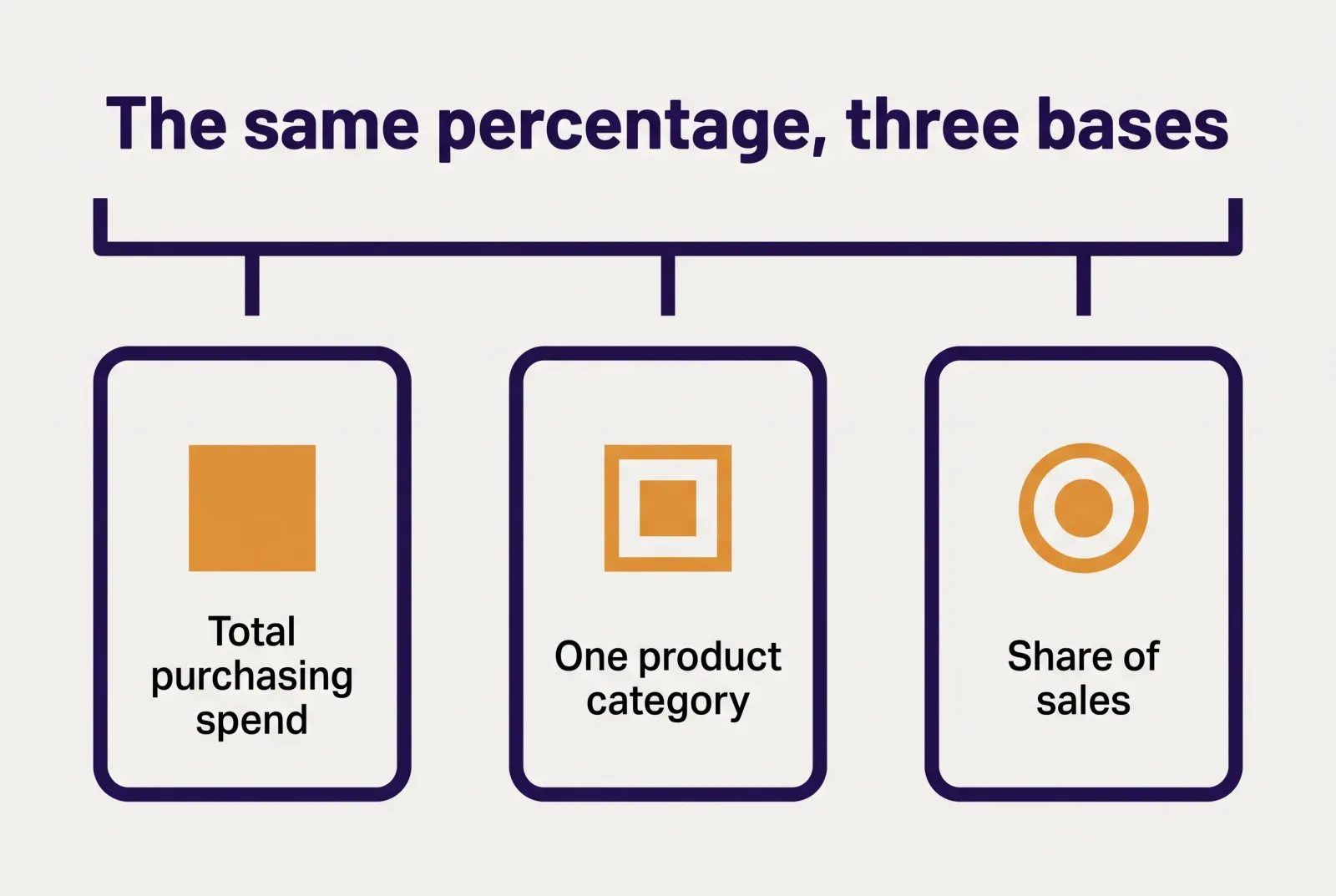
The calculation base is the first coordinate to go missing, and it is the one that moves the meaning of the number the most. "15% off total purchasing spend", "15% off the one category we worked on" and "15% off food cost as a share of sales" are three results an order of magnitude apart, and they are written in exactly the same words.
Some arithmetic, stated as an example and not as an observed figure: picture a restaurant spending $20,000 a month on purchasing, $3,000 of it produce. Fifteen percent off the total is $3,000 a month. Fifteen percent off produce alone is $450. Same headline, and in the second case the benefit is under a sixth of the first — while still being real savings, genuinely achieved. Nobody cheated. The sentence was just ambiguous.
The third base is the sneakiest, because it looks the most professional. Food cost as a share of sales is a ratio, and a ratio improves even when the numerator doesn't move a dollar: the denominator just has to grow. A restaurant that added covers or nudged menu prices watches that share fall without having bought a single case better. If a case study says "15%" and the base is the share of sales, the number is telling you a sales story, not a purchasing story.
Then there is the question of when that base gets read. If your starting spend is whatever falls out of the month-end close, it lands weeks after the decisions that produced it — which is why the food cost you calculate at month-end reads more like an autopsy than a control. A base built on a figure that arrives late is still fine for a historical comparison, but it tells you nothing about what was happening while it was happening.
The question, word for word: "Fifteen percent off what starting amount, and what does that amount include?"
Question two — which spend was actually counted
Scope is the coordinate that widens and narrows until the number works out. It is the spend that actually got counted: which product categories, which suppliers, which lines. And because almost no case study states it, the reader defaults to the widest possible scope — everything the restaurant buys — which is nearly always the wrong one.
There are plenty of honest ways to narrow a scope, and none of them is dishonest in itself. Counting food and leaving out beverage, which often runs on completely different margins and price dynamics. Leaving out non-food: chemicals, disposables, paper, the consumables that weigh more in most operations than people expect. Counting three suppliers out of eight, because the pilot started with those three. Every one of those choices is reasonable. The trouble starts when the choice isn't written down, because at that point a 15% measured on a third of the spend gets read as 15% on all of it.
One case is worth spotting right away. When the scope lines up exactly with the area that was worked on — only the suppliers that went out to bid, only the categories that were reorganized — the number is by construction the highest one available. It isn't false; it's selected. And if the restaurant runs eight suppliers while the result covers three, the real question becomes a different one: what happened to the other five? The answer depends on how fragmented the supply base is, which is a problem of its own — how many suppliers is too many has consequences for your time before it has any for your prices.
Ask this one and you notice something. People who measured answer with a list. People who didn't answer with an adjective. "All food spend" is not a scope. "Food and beverage from our four main suppliers, non-food excluded" is.
The question, word for word: "Which categories and which suppliers are inside that number, and which are outside it?"
Question three — which two periods were compared

The time window decides how much of the result belongs to the tool and how much belongs to the calendar. Comparing November against August in a seasonal restaurant measures the season: spend drops because covers drop, and it would drop with any software installed or with none. You don't need an extreme case to ruin a comparison either — two weeks of closure will do it, or a holiday weekend that fell on one side and not the other, or a month with four Fridays against one with five.
Honest windows come in two shapes, and you can recognize them at a glance. Year over year puts the same period of two different years side by side: it cancels seasonality, but it drags in everything else that changed in the restaurant over twelve months. Back-to-back periods — three months before against three months after — are cleaner on the operating variables and fully exposed to the season. Neither is superior. What matters is that the case study says which one it used, and why.
Then there is the cheapest correction available, the one that makes even mismatched periods comparable: spend per cover. Divide the period's purchasing spend by the covers served in the same period and you get a number that doesn't move just because you were busier or quieter. A second stated example: a restaurant going from $20,000 across 2,000 covers to $19,000 across 1,800 covers has total spend down 5% and spend per cover up, from $10.00 to $10.56. The same reality, read through two indicators, comes out with opposite signs. The true one is the second, and the one that shows up in the case study is almost always the first.
If you don't track covers, a rough but consistent divisor works fine: checks closed, services run, hours open. As long as it is the same divisor on both sides of the comparison.
The question, word for word: "What period did you compare against what, and is the figure normalized per cover?"
Question four — what else changed in those months
Concurrent variables are the coordinate almost nobody names, for an obvious reason: naming it weakens the number. No restaurant changes one thing at a time. Across the three or six months a case study covers, something else almost certainly changed too, and each of those things moves spend exactly the way software would move it.
The list is short and you know it better than I do. The menu, if it got trimmed, or if two dishes came off that dragged five SKUs used nowhere else with them. Covers, which move the total without moving efficiency. Supplier prices, which drift on their own in both directions — and if the comparison window happens to sit on a market dip, that dip ends up inside the 15%. Openings and closures. A change in the kitchen, which may be the most underrated variable of all: a new chef buys differently on day one, before any software.
And then there is the variable that sits so close to the software it gets mistaken for the software. It's the ordering method. Almost everyone who adopts a purchasing system stops ordering from memory at the same moment, and starts checking quantities before hitting send. That change produces a measurable effect on its own, because the wrong quantity is decided on an order line long before the product reaches the bin. A serious case study says so, instead of crediting the product with a result that is half method.
There is a reading trap here worth spelling out. If the case study names no concurrent variable at all, the correct conclusion is not "nothing else changed." It is "we don't know." Ruling a variable out means having looked at it and reported that it held still. Silence is not an exclusion; it is an absence of control.
The question, word for word: "Over those months, what else changed in the restaurant, and how did you keep it out of the number?"
The same four questions, pointed at your own savings
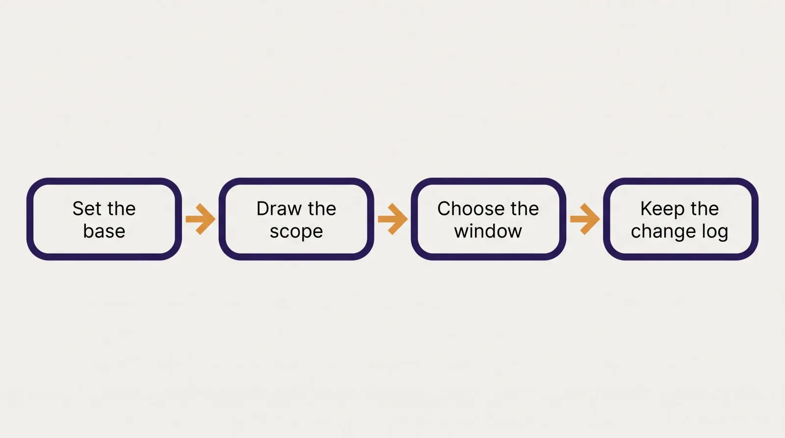
The four coordinates aren't only for reading somebody else's case study. They are the minimum shape of a measurement of your own, and they have an awkward property: they get set in the "before", while you are still evaluating the tool. A baseline rebuilt after the fact isn't a baseline, because by the time you build it you already know which result would suit you, and every ambiguous call — do I count that supplier or not, do I keep that month or drop it — falls the convenient way without you having to want it to.
What you need fits on one sheet of paper and takes an afternoon.
The base. One amount, with its definition next to it. "Purchasing spend, net of tax, as it appears on invoices received in the month" is a definition. "What I spend" isn't. Pick it once and leave it alone: a base you change halfway through the period is the fastest way to end up unable to conclude anything. Decide too whether you are counting off delivery notes or off invoices — the two rarely agree line for line, and reconciling them later is exactly the work you don't want to be doing in month six.
The scope. The list of suppliers and categories inside the number, written out by name. If you leave out non-food or beverage, fine — write it down, so that six months from now you know why the number is what it is.
The window. Decide now which two periods you'll compare, and state them before you start. If your place is seasonal, go year over year; if it isn't, three months against three months is enough. Add the divisor — covers, checks, services — and store it alongside the spend.
The log of changes. This is the zero-cost item on the list: one line, with the date, every time you change something that touches spend. Menu redone. New supplier. Price increase received. Closed for vacation. New chef. Ten lines over six months is plenty, and it's the difference between "down 8%" and "down 8%, part of it explained by a shorter summer menu."
Do those four things and at the end of the period you'll have a number you can defend — and it may well be smaller than the one you'd have hoped for reading a marketing page. It's more useful anyway, because it's yours and you know where it came from. On the practical side, the tedious part is holding spend and scope together without redoing it by hand every month: that is precisely where you want spend by supplier and by category to be readable while you are spending it, rather than reconstructed afterwards from invoices.
Why you won't find a number of ours here
mayo doesn't publish a savings figure of its own. The reason is the one holding up everything you've read so far: we don't yet have a case where all four coordinates are documented and verifiable, and a number without them would be exactly the headline this article just taught you not to believe.
Here is what publishing an honest one would take: a base defined and frozen before adoption, a scope written out by name, two comparable windows with their divisor, and a log of changes kept by whoever actually runs the restaurant. That isn't out of reach — it's a condition that requires having decided, in advance, to measure. When we get there, the number will come out with its four coordinates next to it, even if it turns out smaller than the ones you read elsewhere.
Until then, the only thing worth saying is more modest and more checkable than a percentage: Easy Order makes spend observable while you are spending it — by supplier, by category, by order line — which is the condition under which a measurement of your own becomes possible at all. The savings you measure yourself, with the four questions above. That's the only way that number will be worth anything.
Keep your spending under control with mayo
Up-to-date price lists, centralized orders and prices verified on every delivery. Try it with your team.